All set. We’re live with the new design.
The main feature of the design is that I’ve merged the sideblog into the main blog. The archives are still there, but from now on, I’ll be posting link-posts to the main column. I’ll also be posting short, Twitter-like title-less posts, some of which you’ve probably seen already. By popular demand, comments are open even on the short posts.
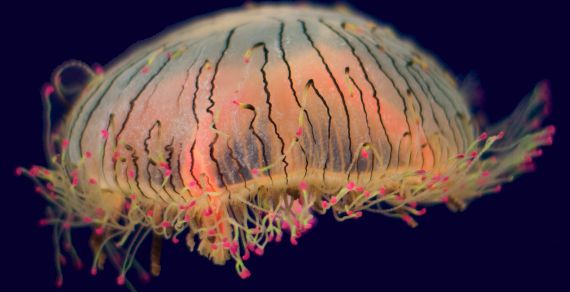
Along with the reformatting, there’s a visual refresh. In a first for the Lab, there’s now an image as part of the site design. (I’ve had occasional pictures in posts, and there was a brief phase when I had photos on the front page, but they were never integrated into the overall color scheme or other design.) That guy in the upper-left is a jellyfish; I took the photo at the Vancouver Aquarium.
The layout isn’t strictly a grid-based layout, but it does use some best-practices of CSS grid designs. You should find that the page scales up and down proportionally if you change font sizes. This is going to look better on Macs and in standards-compliant browsers, but it shouldn’t look awful in anything. Let me know if there are glitches or ugliness, and I’ll see what I can do about fixing it.
